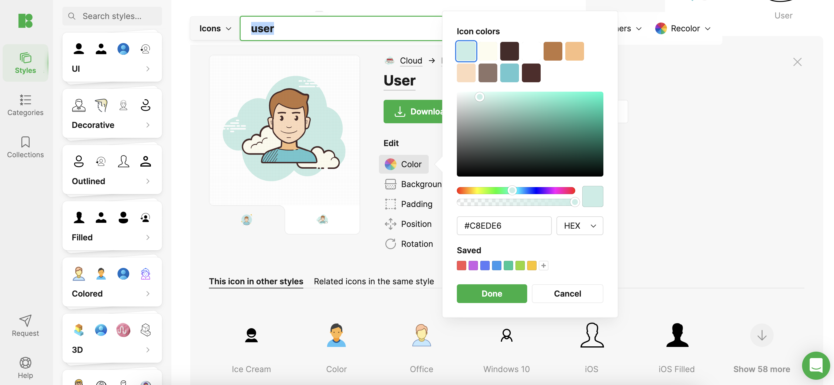
User icons are more than just small graphical representations; they play a crucial role in enhancing both the navigation and overall user experience of a website. These icons have dual functions: they are essential for practical site usability and contribute significantly to its aesthetic appeal.
![]()
Understanding Your Audience
Identifying the specific demographic that will be interacting with your website is essential when selecting the right user icon. Different user groups have varied preferences that influence how they perceive visual elements. For instance, younger audiences may be more attracted to icons that are colorful and dynamically designed, reflecting a more modern aesthetic. In contrast, professional sectors often favor icons that are more understated and formal, aligning with a corporate look. Recognizing these preferences is key to ensuring the icons resonate with your intended audience.
Importance of Simplicity
In the realm of icon design, simplicity reigns supreme. A simple and clear icon not only facilitates immediate recognition but also ensures consistency across various devices and screen sizes, enhancing user interaction. Complex designs, while potentially visually appealing, can confuse users and may not translate well on smaller, portable screens. Keeping icon designs straightforward helps prevent such issues and promotes a smoother user experience.
Brand Alignment
The user icon should act as an integral part of your brand’s visual identity, maintaining consistency in color, style, and overall design. This alignment reinforces your brand’s message and builds user trust. It’s crucial that the icon not only be visually appealing but also embody your brand’s ethos, reflecting its core values and aesthetics in a way that complements the overall branding strategy.
Visibility and Contrast
Visibility is critical for effective icon design. Selecting colors that contrast with the background of your website can make icons stand out and become more accessible to users. However, it is equally important to maintain visual harmony with the website’s design to avoid clashes that could disrupt the user’s visual experience. Striking the right balance between visibility and aesthetic integration is key to designing effective user icons.

Cross-Platform Consistency
Consistency across various platforms and devices is essential for maintaining the integrity of user icons. An icon that appears perfect on a desktop might lose its effectiveness on a mobile app if not designed with cross-platform consistency in mind. Regular testing on different devices can help ensure that icons maintain their functionality and aesthetic appeal, regardless of how users access your site.
User Feedback and Testing
Engaging with your audience is vital in the icon design process. Gathering feedback through methods such as surveys or A/B testing can provide direct insights into how users perceive different icon designs. This feedback is crucial for making informed decisions that can refine and optimize the design to better meet user needs and enhance their experience on the website.
Regular Updates
The digital landscape is constantly evolving, with design trends and user expectations changing over time. Regularly reviewing and updating your user icons can help keep your website contemporary and relevant. This does not necessarily mean complete redesigns; even subtle adjustments can significantly impact the effectiveness of your icons, ensuring they remain engaging and in line with current trends.
Conclusion
Selecting the perfect user icon involves a harmonious blend of aesthetic design, brand consistency, and a focus on user-centric principles. By emphasizing these key elements, you can develop an icon that not only looks appealing but also significantly enhances your website’s functionality and user experience. Remember, the most effective icons are those that appear simple but are crafted with thoughtful, user-focused design decisions.