In app design, the search icon is more than just a functional element; it’s a crucial component that can significantly influence user engagement and satisfaction. This article aims to unveil the secrets behind crafting successful search icons that are visually appealing and highly functional.
Understanding the Function of Search Icons
Search icons serve as the gateway to one of the most frequently used features within apps: the search function. Their design impacts how intuitively users can navigate and how quickly they can access information, making them integral to the overall user experience. A well-designed search icon can make the difference between a good app and a great one by enhancing usability and reducing user frustration.
Fundamentals of Effective Icon Design
- Visibility: The icon must be instantly noticeable. Effective search icons are of a size and color that stand out against the background of the app’s interface, and their placement is typically in consistent, predictable locations like the top-right corner of the screen.
- Simplicity: Icons should be simple and devoid of unnecessary details that could distract or confuse users. A clear and concise design helps ensure that users recognize the icon’s function at a glance.
- Consistency: The search icon’s style must align with the app’s overall design language. This consistency helps reinforce the app’s brand and contributes to a cohesive user experience.
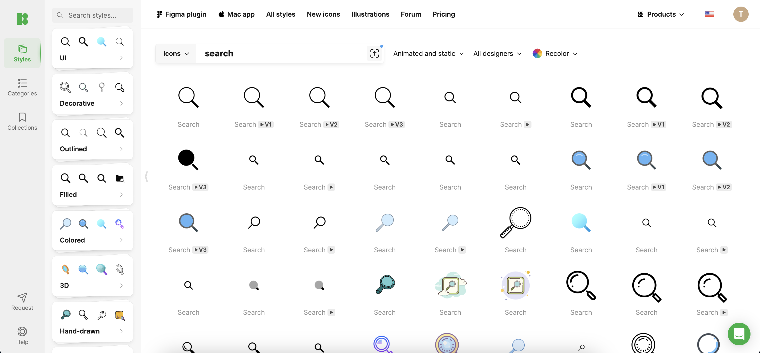
Exploring Icon Varieties
- Standard Icons: The magnifying glass is a universally recognized symbol for search functions, favored for its simplicity and immediate recognition.
- Custom Icons: Custom icons can be tailored to incorporate elements of the app’s brand, making them unique. However, it’s crucial to maintain some elements of standard icons to ensure user recognition.
- Interactive Icons: Some search icons feature interactive elements, such as animations that activate when the user interacts with them, enhancing engagement and providing visual feedback.
Design Process and Best Practices
The design process for search icons should start with understanding the user’s needs and how they interact with the app. Sketching, prototyping, and testing with real users are essential steps to refine the icon. Best practices include conducting A/B testing to compare different designs and using analytics to track how changes affect user behavior.
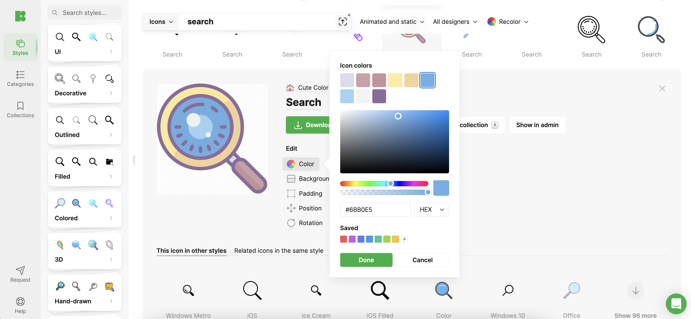
Technological Tools and Resources
Designing the perfect search icon requires sophisticated tools and resources. Icons8 offers a suite of tools that can assist designers in creating, testing, and implementing effective search icons. These tools provide a vast array of design options and the ability to customize icons to fit any app’s unique requirements.
Case Studies
Consider the case of a popular shopping app that redesigned its search icon to a more prominent, easy-to-recognize magnifying glass and saw a 20% increase in search usage. Such success stories underscore the importance of effective search icon design in enhancing app functionality and user satisfaction.
Conclusion
Successful search icon design is a blend of art, science, and understanding of human-computer interaction. By focusing on visibility, simplicity, and consistency and utilizing the right tools, designers can create icons that are not only visually pleasing but also immensely functional.
Call to Action
As you embark on your next design project, consider these strategies for developing an effective search icon. Explore Icons8 for the tools and resources you need to bring your creative visions to life. Share your experiences and insights with the community, and continue to refine your designs based on user feedback and technological advancements. Together, we can shape more intuitive and engaging user interfaces.