Menu icons are more than just aesthetic components in an app. They are essential tools for enhancing user navigation and overall app usability. Effective icons guide users smoothly through your app, making interactions intuitive and efficient.
Fundamentals of User-Friendly Icon Design
Menu icons should be instantly recognizable and convey clear functions. Key design principles include clarity, simplicity, and recognizability. The goal is for users to understand an icon’s purpose at a glance without needing text explanations.
Design Process for Menu Icons
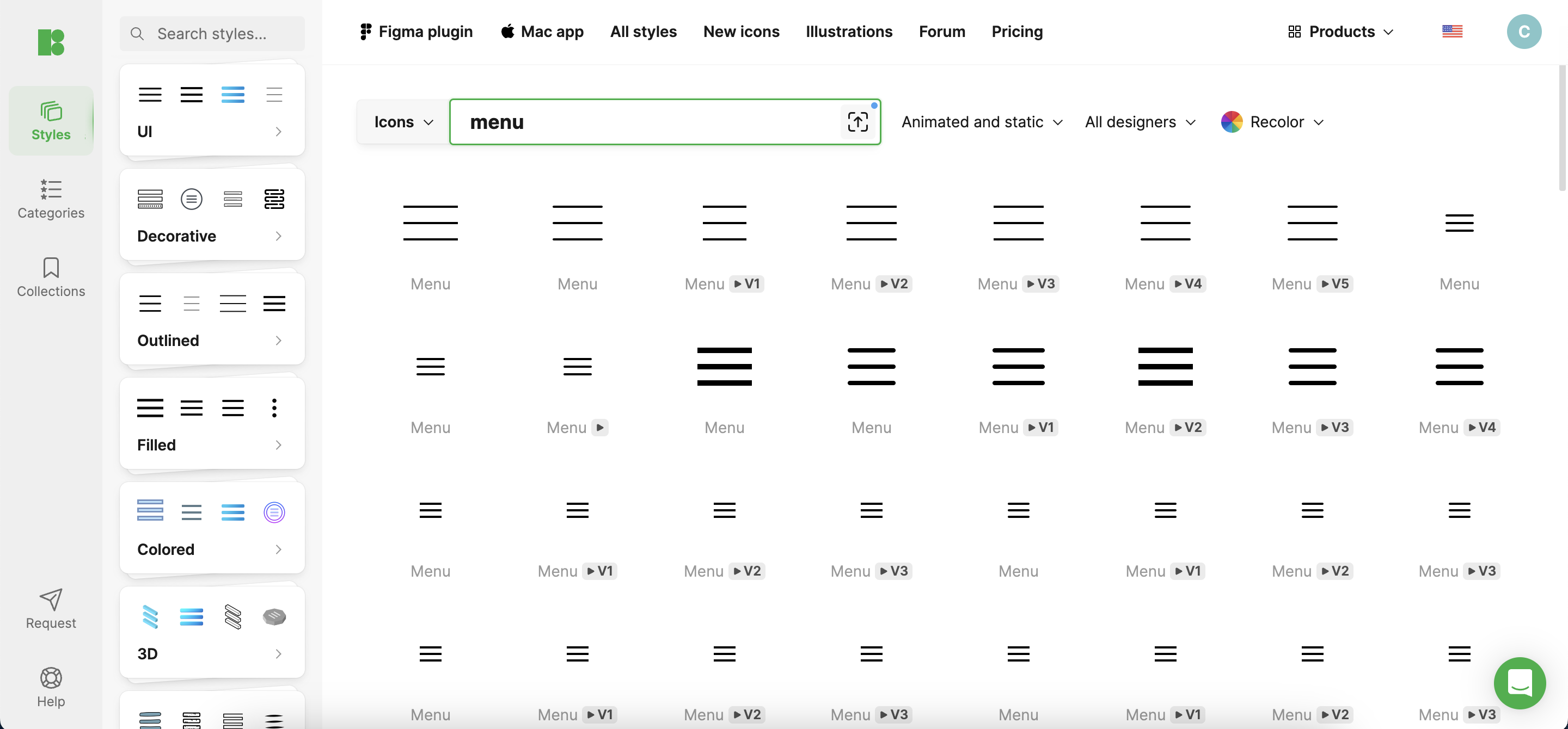
- Research and Inspiration: Start by examining successful apps, especially those popular among your target audience. Note which icon designs resonate with users and why. This initial research can spark ideas tailored to your app’s specific needs. Tools like Icons8 can be invaluable here, providing a vast library of icon designs for inspiration.
- Sketching and Conceptualization: Begin with rough sketches to visualize ideas. Experiment with different styles that align with your app’s branding. This phase is about exploring creative possibilities without committing to one direction prematurely.
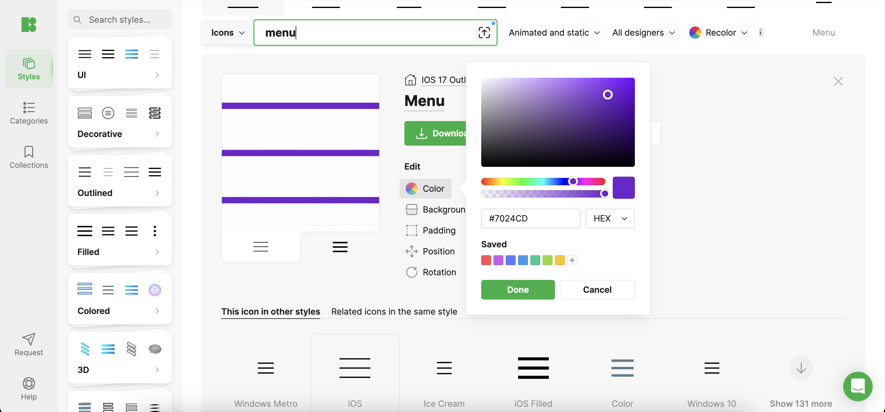
- Digitalization and Refinement: Convert your sketches into a digital format using design software. This is where precision takes shape. Refine your icons based on aesthetic balance, thematic consistency, and feedback from preliminary user tests. Again, Icons8 offers tools that can streamline this process, making it easier to create high-quality digital icons.
Technical Considerations
- Size and Resolution: Icons should be clear and legible across all device resolutions. Design with scalability in mind ensures icons maintain their integrity on large tablets and smaller smartphones.
- Color and Contrast: Select colors that stand out yet are harmonious with the app’s overall design palette. Ensure sufficient contrast for visibility, especially under different lighting conditions, and consider accessibility to aid users with visual impairments.
Testing with Users
User testing is crucial. It’s not enough for your design team to approve an icon’s look; it must resonate with actual users. Employ methods like A/B testing to gather insights into user preferences and usability. Adjust designs based on this direct feedback to refine and perfect your icons.
Implementation Tips
When integrating icons into your app, maintain consistency across all screens. Utilize tools like Adobe XD or Sketch to design and test icon implementations within the app interface. Icons8 can be used here to quickly test different icons directly within your design mockups, ensuring they fit perfectly with the app’s user interface.
Case Studies
Consider the evolution of icons in apps like Spotify, where simplicity and bold imagery guide users fluidly through music navigation. These cases demonstrate the effectiveness of well-thought-out icon designs in improving user experiences.
Conclusion
Creating user-friendly menu icons is a dynamic and essential part of app design. By focusing on user needs, testing thoroughly, and applying consistent design principles, you can develop icons that not only look great but also enhance your app’s functionality and user-friendliness. Leveraging resources like Icons8 can significantly simplify this process, helping you achieve professional results with less effort and time.